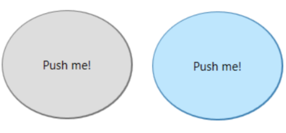
In this article I will show you how to create a circular button in WPF. The intention is to keep the functionality and colors exactly as they are but only change the shape of the button. This ensures that this circular button can be used in the same way as a normal button where the properties like Background, BorderThickness, Foreground and so on keep its functionality.
First of all we create a copy of the button style as described here and name it CircularButtonStyle.
This results in the following style to be inserted in your xaml where the button resides.
<Style x:Key="FocusVisual">
<Setter Property="Control.Template">
<Setter.Value>
<ControlTemplate>
<Rectangle Margin="2" SnapsToDevicePixels="true" Stroke="{DynamicResource {x:Static SystemColors.ControlTextBrushKey}}" StrokeThickness="1" StrokeDashArray="1 2"/>
</ControlTemplate>
</Setter.Value>
</Setter>
</Style>
<SolidColorBrush x:Key="Button.Static.Background" Color="#FFDDDDDD"/>
<SolidColorBrush x:Key="Button.Static.Border" Color="#FF707070"/>
<SolidColorBrush x:Key="Button.MouseOver.Background" Color="#FFBEE6FD"/>
<SolidColorBrush x:Key="Button.MouseOver.Border" Color="#FF3C7FB1"/>
<SolidColorBrush x:Key="Button.Pressed.Background" Color="#FFC4E5F6"/>
<SolidColorBrush x:Key="Button.Pressed.Border" Color="#FF2C628B"/>
<SolidColorBrush x:Key="Button.Disabled.Background" Color="#FFF4F4F4"/>
<SolidColorBrush x:Key="Button.Disabled.Border" Color="#FFADB2B5"/>
<SolidColorBrush x:Key="Button.Disabled.Foreground" Color="#FF838383"/>
<Style x:Key="CircularButtonStyle" TargetType="{x:Type Button}">
<Setter Property="FocusVisualStyle" Value="{StaticResource FocusVisual}"/>
<Setter Property="Background" Value="{StaticResource Button.Static.Background}"/>
<Setter Property="BorderBrush" Value="{StaticResource Button.Static.Border}"/>
<Setter Property="Foreground" Value="{DynamicResource {x:Static SystemColors.ControlTextBrushKey}}"/>
<Setter Property="BorderThickness" Value="1"/>
<Setter Property="HorizontalContentAlignment" Value="Center"/>
<Setter Property="VerticalContentAlignment" Value="Center"/>
<Setter Property="Padding" Value="1"/>
<Setter Property="Template">
<Setter.Value>
<ControlTemplate TargetType="{x:Type Button}">
<Border x:Name="border" BorderBrush="{TemplateBinding BorderBrush}" BorderThickness="{TemplateBinding BorderThickness}" Background="{TemplateBinding Background}" SnapsToDevicePixels="true">
<ContentPresenter x:Name="contentPresenter" Focusable="False" HorizontalAlignment="{TemplateBinding HorizontalContentAlignment}" Margin="{TemplateBinding Padding}" RecognizesAccessKey="True" SnapsToDevicePixels="{TemplateBinding SnapsToDevicePixels}" VerticalAlignment="{TemplateBinding VerticalContentAlignment}"/>
</Border>
<ControlTemplate.Triggers>
<Trigger Property="IsDefaulted" Value="true">
<Setter Property="BorderBrush" TargetName="border" Value="{DynamicResource {x:Static SystemColors.HighlightBrushKey}}"/>
</Trigger>
<Trigger Property="IsMouseOver" Value="true">
<Setter Property="Background" TargetName="border" Value="{StaticResource Button.MouseOver.Background}"/>
<Setter Property="BorderBrush" TargetName="border" Value="{StaticResource Button.MouseOver.Border}"/>
</Trigger>
<Trigger Property="IsPressed" Value="true">
<Setter Property="Background" TargetName="border" Value="{StaticResource Button.Pressed.Background}"/>
<Setter Property="BorderBrush" TargetName="border" Value="{StaticResource Button.Pressed.Border}"/>
</Trigger>
<Trigger Property="IsEnabled" Value="false">
<Setter Property="Background" TargetName="border" Value="{StaticResource Button.Disabled.Background}"/>
<Setter Property="BorderBrush" TargetName="border" Value="{StaticResource Button.Disabled.Border}"/>
<Setter Property="TextElement.Foreground" TargetName="contentPresenter" Value="{StaticResource Button.Disabled.Foreground}"/>
</Trigger>
</ControlTemplate.Triggers>
</ControlTemplate>
</Setter.Value>
</Setter>
</Style> Code language: HTML, XML (xml)Now, that we have the default style we can change it. As I told you above I just want to change the shape of the button but keep the rest as it is.
This is the first code section we need to change:
<ControlTemplate TargetType="{x:Type Button}">
    <Border x:Name="border" BorderBrush="{TemplateBinding BorderBrush}" BorderThickness="{TemplateBinding BorderThickness}" Background="{TemplateBinding Background}" SnapsToDevicePixels="true">
        <ContentPresenter x:Name="contentPresenter" Focusable="False" HorizontalAlignment="{TemplateBinding HorizontalContentAlignment}" Margin="{TemplateBinding Padding}" RecognizesAccessKey="True" SnapsToDevicePixels="{TemplateBinding SnapsToDevicePixels}" VerticalAlignment="{TemplateBinding VerticalContentAlignment}"/>
    </Border>Code language: HTML, XML (xml)
We will replace the border with two ellipse shapes. An outer ellipse as border and an inner ellipse. The ContentPresenter will be added after the two ellipses to be drawn on top of it. The ContentPresenter is important to render the content (e.g. the button text, a picture or any other content). We surrond these elements by a Grid as a ControlTemplate supports only a single content.
<Grid>
    <Ellipse x:Name="BorderEllipse" Fill="{TemplateBinding BorderBrush}" SnapsToDevicePixels="True"/>
    <Ellipse x:Name="InnerEllipse" Margin="{TemplateBinding BorderThickness}" Fill="{TemplateBinding Background}" SnapsToDevicePixels="True"/>

    <ContentPresenter x:Name="contentPresenter" Focusable="False" HorizontalAlignment="{TemplateBinding HorizontalContentAlignment}" Margin="{TemplateBinding Padding}" RecognizesAccessKey="True" SnapsToDevicePixels="{TemplateBinding SnapsToDevicePixels}" VerticalAlignment="{TemplateBinding VerticalContentAlignment}"/>
</Grid>Code language: HTML, XML (xml)
Next, we need to change the triggers. The triggers change the appearance of the button in response to some events like MouseOver. The events target the Border and set border color and the border background. Translated to our two ellipses the border color is delegated to the outer ellipse and the border background delegates to the inner ellipse.
<Trigger Property="IsDefaulted" Value="true">
    <Setter Property="Fill" TargetName="BorderEllipse" Value="{DynamicResource {x:Static SystemColors.HighlightBrushKey}}"/>
</Trigger>
<Trigger Property="IsMouseOver" Value="true">
    <Setter Property="Fill" TargetName="InnerEllipse" Value="{StaticResource Button.MouseOver.Background}"/>
    <Setter Property="Fill" TargetName="BorderEllipse" Value="{StaticResource Button.MouseOver.Border}"/>
</Trigger>
<Trigger Property="IsPressed" Value="true">
    <Setter Property="Fill" TargetName="InnerEllipse" Value="{StaticResource Button.Pressed.Background}"/>
    <Setter Property="Fill" TargetName="BorderEllipse" Value="{StaticResource Button.Pressed.Border}"/>
</Trigger>
<Trigger Property="IsEnabled" Value="false">
    <Setter Property="Fill" TargetName="InnerEllipse" Value="{StaticResource Button.Disabled.Background}"/>
    <Setter Property="Fill" TargetName="BorderEllipse" Value="{StaticResource Button.Disabled.Border}"/>
    <Setter Property="TextElement.Foreground" TargetName="contentPresenter" Value="{StaticResource Button.Disabled.Foreground}"/>
</Trigger>Code language: HTML, XML (xml)
The last thing we need to change is the focus visual. This control template defines the appearance of the focus indication. Therefore we only need to change the shape in the FocusVisual style from Rectangle to Ellipse.
<Style x:Key="FocusVisual">
    <Setter Property="Control.Template">
        <Setter.Value>
            <ControlTemplate>
                <Ellipse Margin="2" SnapsToDevicePixels="true" Stroke="{DynamicResource {x:Static SystemColors.ControlTextBrushKey}}" StrokeThickness="1" StrokeDashArray="1 2"/>
            </ControlTemplate>
        </Setter.Value>
    </Setter>
</Style>Code language: HTML, XML (xml)
To use the circular button style you simply need to apply the style on a button.
<Button Style="{DynamicResource CircularButtonStyle}"/>Code language: HTML, XML (xml)Complete Listing:
<Style x:Key="FocusVisual">
    <Setter Property="Control.Template">
        <Setter.Value>
            <ControlTemplate>
                <Ellipse Margin="2" SnapsToDevicePixels="true" Stroke="{DynamicResource {x:Static SystemColors.ControlTextBrushKey}}" StrokeThickness="1" StrokeDashArray="1 2"/>
            </ControlTemplate>
        </Setter.Value>
    </Setter>
</Style>
<SolidColorBrush x:Key="Button.Static.Background" Color="#FFDDDDDD"/>
<SolidColorBrush x:Key="Button.Static.Border" Color="#FF707070"/>
<SolidColorBrush x:Key="Button.MouseOver.Background" Color="#FFBEE6FD"/>
<SolidColorBrush x:Key="Button.MouseOver.Border" Color="#FF3C7FB1"/>
<SolidColorBrush x:Key="Button.Pressed.Background" Color="#FFC4E5F6"/>
<SolidColorBrush x:Key="Button.Pressed.Border" Color="#FF2C628B"/>
<SolidColorBrush x:Key="Button.Disabled.Background" Color="#FFF4F4F4"/>
<SolidColorBrush x:Key="Button.Disabled.Border" Color="#FFADB2B5"/>
<SolidColorBrush x:Key="Button.Disabled.Foreground" Color="#FF838383"/>
<Style x:Key="CircularButtonStyle" TargetType="{x:Type Button}">
    <Setter Property="FocusVisualStyle" Value="{StaticResource FocusVisual}"/>
    <Setter Property="Background" Value="{StaticResource Button.Static.Background}"/>
    <Setter Property="BorderBrush" Value="{StaticResource Button.Static.Border}"/>
    <Setter Property="Foreground" Value="{DynamicResource {x:Static SystemColors.ControlTextBrushKey}}"/>
    <Setter Property="BorderThickness" Value="1"/>
    <Setter Property="HorizontalContentAlignment" Value="Center"/>
    <Setter Property="VerticalContentAlignment" Value="Center"/>
    <Setter Property="Padding" Value="1"/>
    <Setter Property="Template">
        <Setter.Value>
            <ControlTemplate TargetType="{x:Type Button}">
                <Grid>
                    <Ellipse x:Name="BorderEllipse" Fill="{TemplateBinding BorderBrush}" SnapsToDevicePixels="True"/>
                    <Ellipse x:Name="InnerEllipse" Margin="{TemplateBinding BorderThickness}" Fill="{TemplateBinding Background}" SnapsToDevicePixels="True"/>

                    <ContentPresenter x:Name="contentPresenter" Focusable="False" HorizontalAlignment="{TemplateBinding HorizontalContentAlignment}" Margin="{TemplateBinding Padding}" RecognizesAccessKey="True" SnapsToDevicePixels="{TemplateBinding SnapsToDevicePixels}" VerticalAlignment="{TemplateBinding VerticalContentAlignment}"/>
                </Grid>
                <ControlTemplate.Triggers>
                    <Trigger Property="IsDefaulted" Value="true">
                        <Setter Property="Fill" TargetName="BorderEllipse" Value="{DynamicResource {x:Static SystemColors.HighlightBrushKey}}"/>
                    </Trigger>
                    <Trigger Property="IsMouseOver" Value="true">
                        <Setter Property="Fill" TargetName="InnerEllipse" Value="{StaticResource Button.MouseOver.Background}"/>
                        <Setter Property="Fill" TargetName="BorderEllipse" Value="{StaticResource Button.MouseOver.Border}"/>
                    </Trigger>
                    <Trigger Property="IsPressed" Value="true">
                        <Setter Property="Fill" TargetName="InnerEllipse" Value="{StaticResource Button.Pressed.Background}"/>
                        <Setter Property="Fill" TargetName="BorderEllipse" Value="{StaticResource Button.Pressed.Border}"/>
                    </Trigger>
                    <Trigger Property="IsEnabled" Value="false">
                        <Setter Property="Fill" TargetName="InnerEllipse" Value="{StaticResource Button.Disabled.Background}"/>
                        <Setter Property="Fill" TargetName="BorderEllipse" Value="{StaticResource Button.Disabled.Border}"/>
                        <Setter Property="TextElement.Foreground" TargetName="contentPresenter" Value="{StaticResource Button.Disabled.Foreground}"/>
                    </Trigger>
                </ControlTemplate.Triggers>
            </ControlTemplate>
        </Setter.Value>
    </Setter>
</Style>Code language: HTML, XML (xml)
Be First to Comment